Case Study · UX Product Design
Building engagement with users
Overview
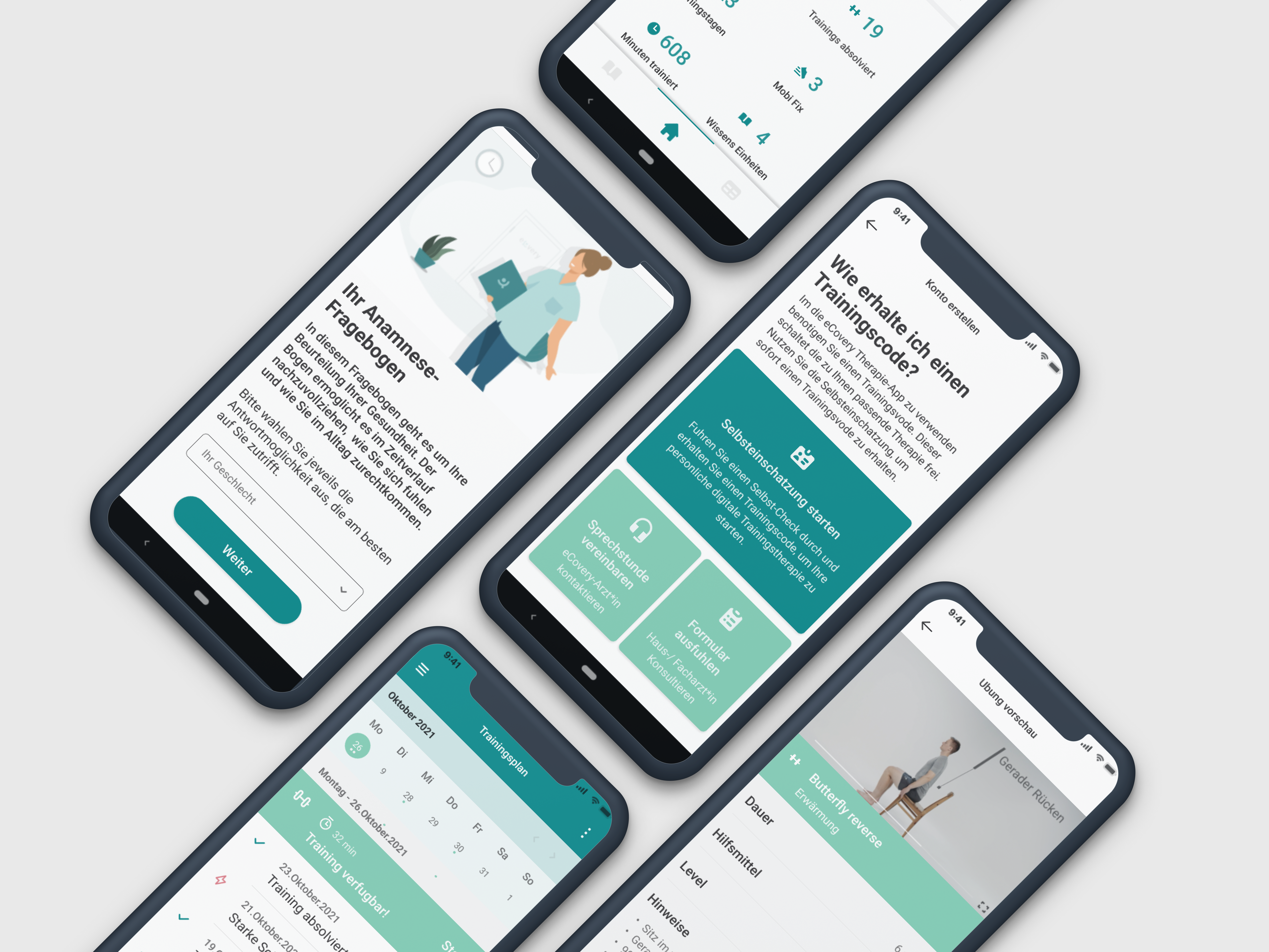
eCovery is a certified digital physiotherapy application — a pocket physio helper providing patients with safe, guided therapy exercises at home, accompanying them through their recovery.
The service requires users to log in 2–3 times per week for 12 weeks. Engagement and commitment are essential for clinical outcomes. My role was to understand why users weren’t staying, and design a product that gave them real reasons to return.
“What is the user trying to accomplish? What is stopping them from doing it?”
Research & Discovery
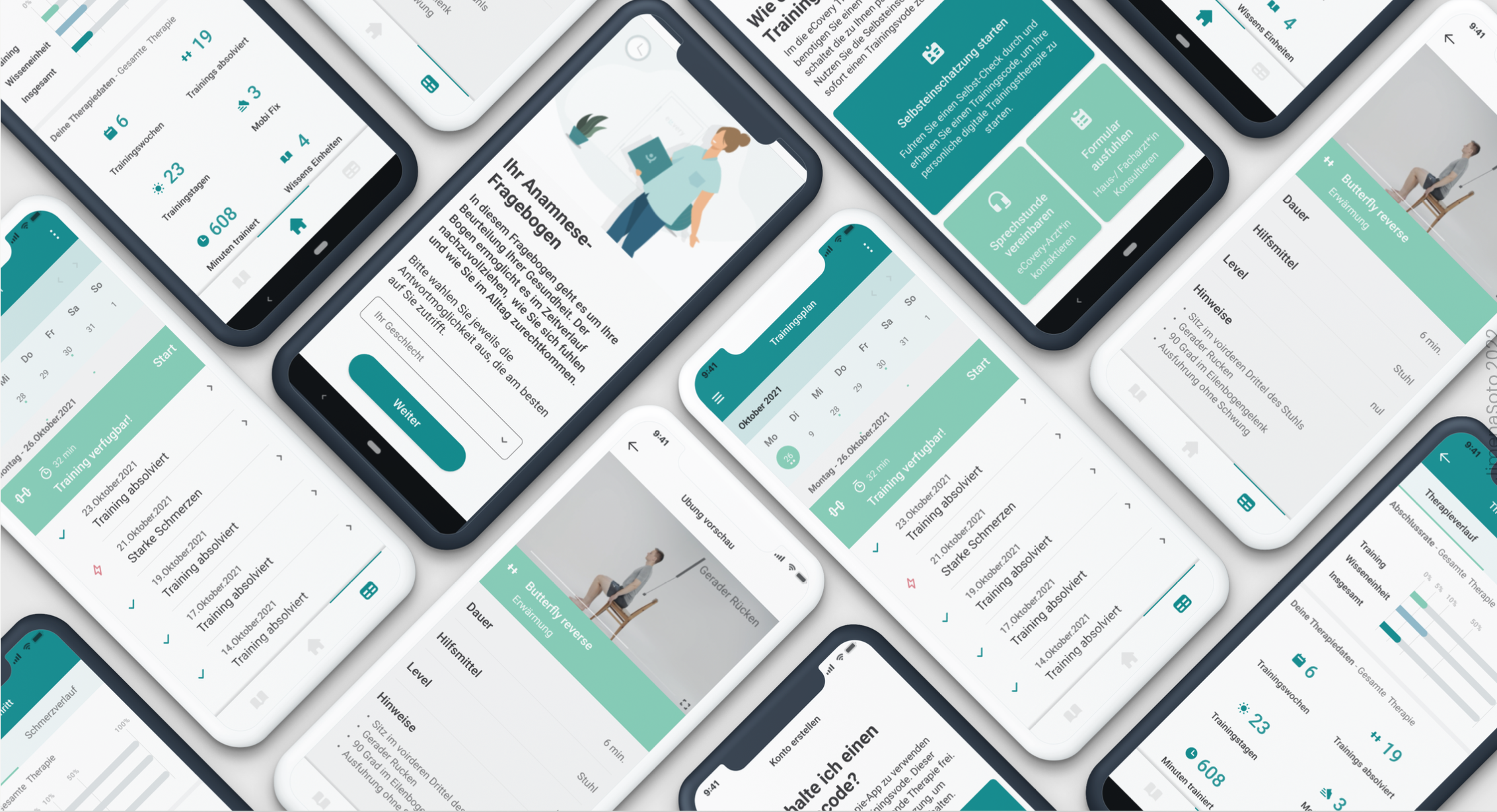
I conducted usability testing and user interviews, following participants through the full application flow — from onboarding to completing a training session. I also led an initial UX audit of the MVP, identifying gaps that risked reducing commitment to the program.
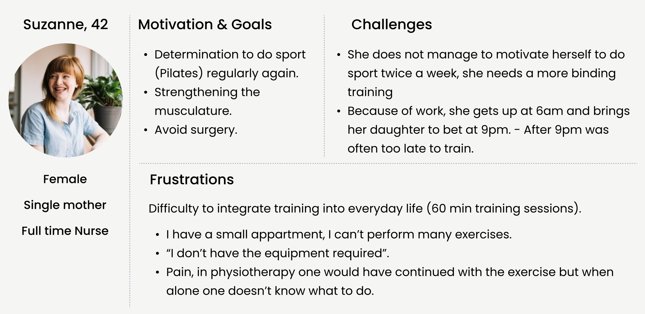
Our user: Suzanne, 42. Full-time nurse, single mother. Recovering from surgery and struggling to maintain a consistent training routine around a demanding schedule.
Intake didn’t ask enough about the user’s medical situation. Users felt their case wasn’t being followed personally.
Required equipment wasn’t commonly available at home. Option to delay start broke the initial impulse to commit.
Planning a 12-week program without a calendar view was difficult. Users couldn’t see the full picture of recovery.
Progress information wasn’t meaningful. Users wanted to see their training plan, not just the next session.
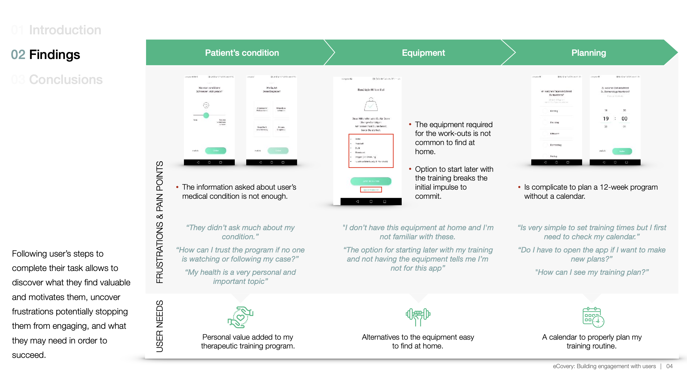
“They didn’t ask much about my condition.”
“How can I trust the program if no one is watching or following my case?”
“I don’t have this equipment at home and I’m not familiar with these.”
“Is very simple to set training times but I first need to check my calendar.”
“After several exercises is hard to keep track on how much is left doing for today.”
Design Decisions
As a healthcare digital service, treatment must feel personal — responding to the user’s actual situation. The product needed to make users feel accountable and supported throughout recovery.
-
01
Ask more about the user’s medical condition
Make them feel their program is tailored by specialists, not generic.
-
02
Avoid interrupting the first impulse
Show how the product works first, motivating users to set up and get started immediately.
-
03
Calendar view for the training program
Seeing the whole month helps users introduce a new routine into daily life.
-
04
Home alternatives to equipment
If the exercise requires a stepper, suggest the stairs. Users need to adapt to their actual space.
-
05
Progress bar during training sessions
Make remaining time visible. We all look at the clock until we’re done.
-
06
Training plan on the home screen
Keep dashboard accessible below. Add checkboxes in repetition-based exercises to prevent accidental drop-outs.
Deliverables
End-to-end product design work delivered in close collaboration with development and clinical teams throughout the 18-month engagement.
Agency Work · 2018
DoubleDigit — UX Design Internship
Applied design process methods across client projects in an agile agency environment, working closely with project management and development teams in San José.
Mapped the full user journey from homepage to quotation. Identified drop-off points through card sorting, journey mapping, and heuristic analysis. Proposed wireframe optimisations to reduce friction.
Information architectures, user flows, wireframes and lo-fi prototypes for digital products in social impact, talent recruitment, and the automotive industry.
Card sorting · User flows · Personas · Journey maps · Heuristic evaluation · Wireframes · Lo-fi prototypes · Usability testing
Structured design recommendations — user flows, information architecture, decision flows, and wireframe proposals — handed off to the UI team for visual design and development.